
- Summary
I am a UX Engineer with 5+ years of experience designing and building SaaS products and web applications. My expertise spans user research, information architecture, wireframing, prototyping, and usability testing, paired with hands-on development skills in HTML, CSS, JavaScript, React, and Tailwind.
I specialize in creating responsive, accessible, and pixel-perfect interfaces that balance user needs, business goals, and technical feasibility. Experienced in working with cross-functional teams, I bridge the gap between design and engineering to deliver scalable solutions and maintain design systems.
Passionate about emerging tools, I actively leverage AI-assisted design to streamline workflows, accelerate prototyping, and drive innovation in product design.
This process typically includes designing an intuitive user interface, crafting engaging content, and incorporating dynamic elements to highlight the services offered. Webflow’s capabilities on this Project allowed for the integration of contact forms, booking or scheduling systems, and secure payment options if applicable. Ensuring mobile responsiveness and optimizing the website for search engines are essential for reaching a broader audience. Overall, building a service company’s website with Webflow aims to effectively represent the company, attract clients, and facilitate seamless interactions between the business and its customers.


Delighted to unveil this creation: a network communication website that prioritizes connectivity with a minimalist touch. Our design ethos revolves around simplicity, ensuring seamless interaction for users to engage and collaborate effortlessly. Thrilled to introduce a platform where networking meets intuitive design, fostering meaningful connections in the digital realm!

Creating a State’s Agency website involved developing a versatile and accessible platform to provide essential information and services to the public. This process included the designing of a user-friendly interface, organizing content such as Government resources, news, and contact details, and integrating features for citizens, such as forms for services and document downloads. The incorporation of accessibility features and responsive design was adhered to, to ensure usability across various devices and for individuals with disabilities.


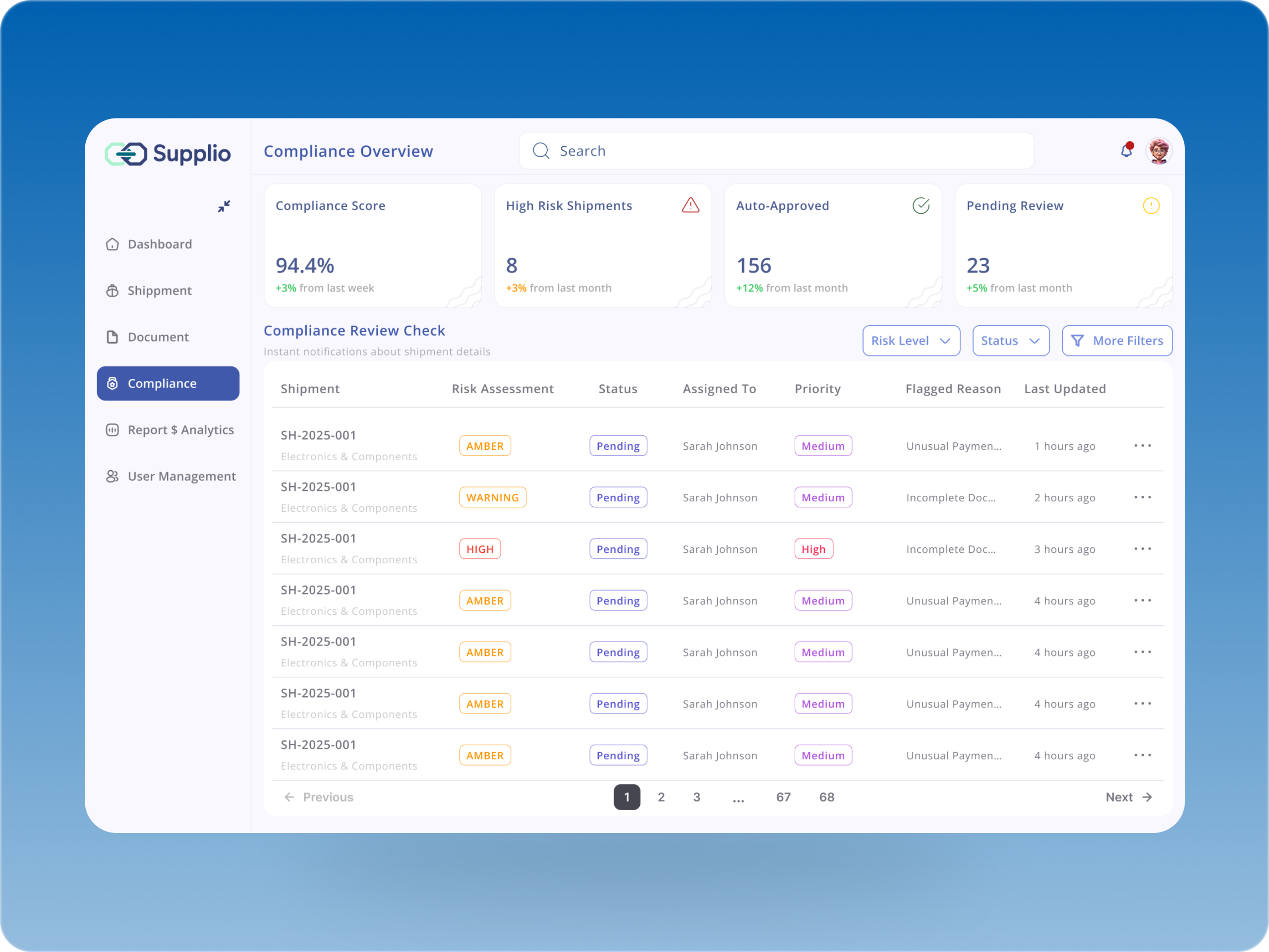
Think about Compliance Monitoring in Supply Chain Management (Shipping), a process often filled with paperwork, delays, and inefficiencies.
For this project, I approached the compliance page with a meticulous design process: starting from user research to uncover real pain points, mapping clear user flows and information architecture for smooth navigation, and crafting an intuitive interface in Figma.
Using Maze testing, I validated the design with real users and refined every interaction for clarity, accessibility, and trust. The result is a compliance experience that feels effortless, transparent, and scalable for modern supply chains.
This project revolves around the development of a dynamic ecommerce store meticulously crafted using Webflow. The primary focus lies in creating a visually appealing and user-friendly interface that seamlessly integrates with the client’s brand identity. Through the implementation of Webflow’s versatile design tools, we aim to enhance the overall shopping experience for customers, ensuring smooth navigation and an aesthetically pleasing presentation of products.

The website prioritizes responsive design, ensuring optimal accessibility across various devices. In addition to a sleek and modern aesthetic, the site integrates robust features for showcasing the company’s diverse energy solutions, providing users with comprehensive information on services offered. With secure online functionalities, the website enhances user engagement and facilitates seamless interactions, ultimately positioning the energy service company as a leader in the industry.

Just wrapped up a clean, data-driven dashboard interface for managing student exam results.
The goal was to make academic data more human-readable — focusing on clarity, accessibility, and structure that educators actually enjoy using.
🔹 Overview cards display GPA, credits, and rank at a glance.
🔹 A well-organized table summarizes student performance with color-coded status tags.
🔹 Built for scalability — ready to adapt for full edtech systems.
This project explores how thoughtful design and minimal visuals can make complex academic data intuitive.

Here’s a snippet of a new dental clinic website I’m currently developing — focused on delivering a modern, Apple-style experience that blends trust, clarity, and conversion.
As always, the process follows my structured UI/UX flow:
User Research & Competitor Analysis – understanding patient needs, trust triggers, and clinic communication gaps.
User Flow & Information Architecture – ensuring a smooth navigation path from awareness to appointment booking.
Wireframing & Visual Design – clean lilac and white palette, minimal typography, and accessible layout.
Prototype & Usability Testing – refining interactions for clarity and responsiveness across devices.
Development Phase – built with HTML, CSS, and JavaScript for performance and scalability.
I’ll be sharing the complete flow, design system, and CRO considerations soon. Stay tuned. 💜🦷

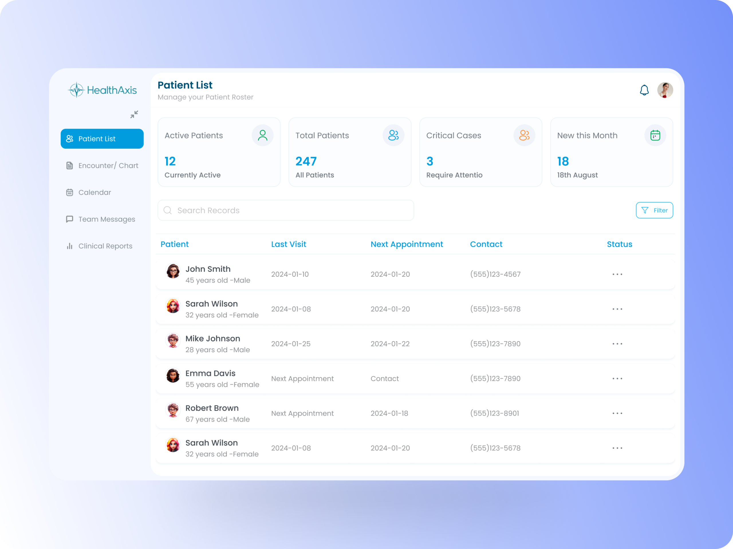
One of the biggest challenges in hospital management systems is making patient data easy to access, clear to scan, and secure. For HealthAxis, I designed the Patient List page to give doctors and administrators a quick overview of patients, while ensuring that details like appointments, records, and status could be accessed with minimal clicks.
The design process started with user research to understand what information doctors prioritize (recent visits, ongoing treatments, next appointments) and how administrators manage scheduling. I mapped these into user flows and structured the information architecture so the most critical data appears first, supported by search, filters, and sorting for efficiency.
After wireframing and prototyping, I validated the design with Maze testing, where feedback confirmed that the page reduced cognitive load and improved task completion speed. The final design balances clarity, accessibility, and trust — making the patient list a true command center for care coordination.
Redesign of an Airbnb-style dashboard!
The focus was on improving user flow + visual appeal with a touch of Glassmorphism:
- Total credit balance made bold + central
- Modern pie chart for a quick financial snapshot
- Cleaner booking workflows with clear labels
- Expanded tables for easy scanning
- Glassmorphic cards & nav bar to draw attention to key actions
The result? A dashboard that feels modern, elegant, and effortless to use.

The Hirenest AI Sourcing website was designed in Figma with a strong focus on CRO (Conversion Rate Optimization), SEO best practices, and a user-journey-driven approach. With a clear information architecture and intuitive navigation, the site helps companies discover and engage with AI-powered sourcing solutions more efficiently.
This project challenged me to align design decisions with user behavior, streamline the recruitment funnel, and ensure every interaction, from landing to conversion, was purposeful and performance-focused.
